

The Natural Resource Sector project at 865 Hornby was a government workplace relocation shaped by the Province's Leading Workplace Standards. These projects are rarely just about the physical space, they're about moving people, and that means the design work and the transition work need to be part of the same conversation.
Beyond The Framework
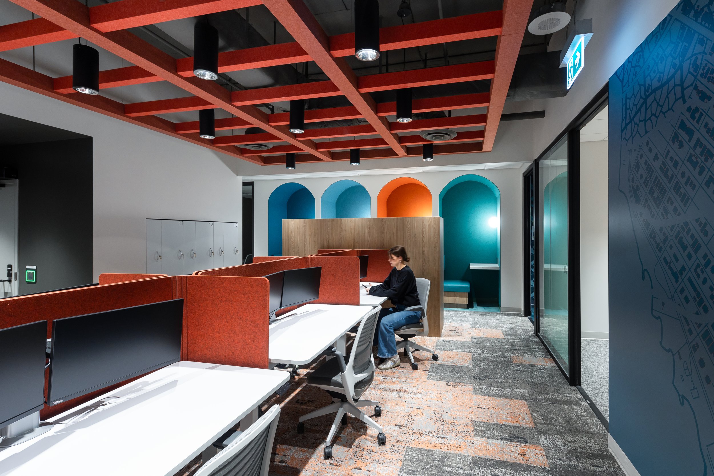
What made the Leading Workplace Standards different from a typical brief was the starting assumption. Instead of beginning with the idea that everybody needs the same workstation, the framework asked us to design around how people actually work: individually, collaboratively, socially, in groups. That sounds straightforward, but it changes how you think about a floor plate. Rather than dividing space by department, you're creating a variety of settings — resident workpoints, flexible stations, quiet rooms, privacy rooms, solo booths, meeting rooms, social spaces — and trusting that people will move between them based on what they need to do.
The system also had to be flexible. The same planning logic needed to accommodate different teams, different daily rhythms, and the reality that how people work continues to shift.
Value as a Design Exercise
Value engineering ran throughout this project, not just at the end. Rather than treating it as a cost-cutting exercise, we used it as a design and prioritization tool — looking at where money was being spent, what mattered most to the user experience, and where we could find efficiencies without losing the intent.
Sometimes that meant adjusting materials, sometimes detailing, sometimes finding a different way to achieve the same requirement. The objective was always to protect what made the workplace work: choice, comfort, functionality, flexibility, and quality.

Layers
What set this project apart from a typical tenant fit-out was the number of moving pieces that all had to align. Workplace standards, user requirements from three separate government offices, architectural and interior design, acoustics, furniture, AV and technology, graphics and wayfinding, change management, budget pressures, and finally move coordination and operational readiness. None of those things existed in isolation.
Move-in planning was where it all came together. We worked closely with the client's change-management team to develop sequencing that would minimize disruption. Staff weren't just changing addresses — they were moving from separate offices into a shared workplace, and for many, adopting new ways of working. The success of the space was going to be measured by whether whether people could walk in on day one, understand how to use the environment, and actually get to work.


Identity within standardization
One of the defining realizations on this project was that working within a standardized framework doesn't have to produce something generic. The planning could be systematic — shared amenities, modular workpoints, a repeatable logic for meeting and focus spaces — while the experience could still be specific to Vancouver.
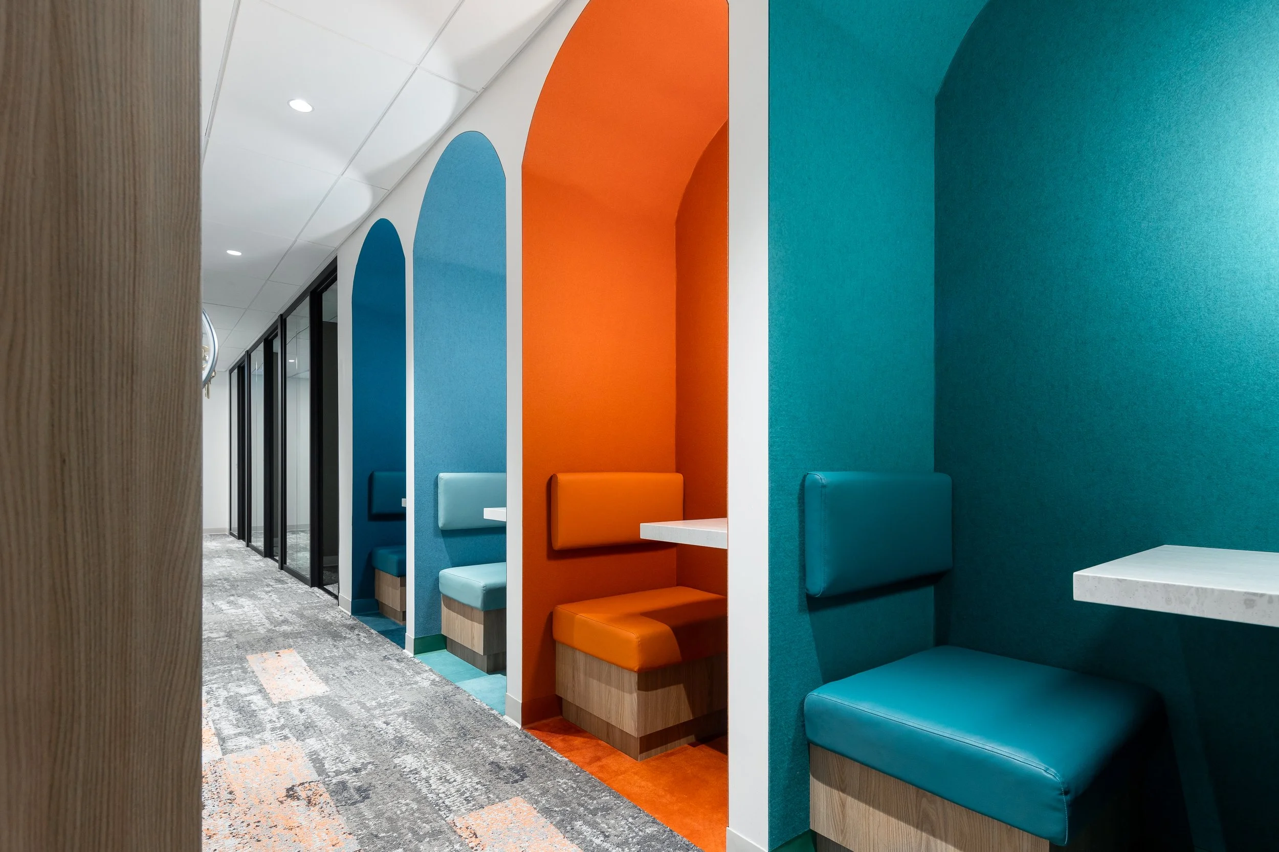
We separated the workplace system from the identity of the place. The system provides the infrastructure: the gradient of privacy, the acoustic control, the modular planning, the shared resources. The identity comes through in the colour, the materials, the graphics, the wayfinding.
The palette was drawn from the Vancouver skyline at dusk — blues and teals referencing the water, sky and mountains, warmer oranges carrying the sunset. Graphics reference the mountain range visible from downtown and incorporate a map of the city core. In the smaller spaces, those colours are immersive. In the broader workplace, they're present but held back.
That balance became one of the stronger ideas in the project. You can have consistency in the underlying principles while still creating a space that responds to its users and its context.
What holds it together
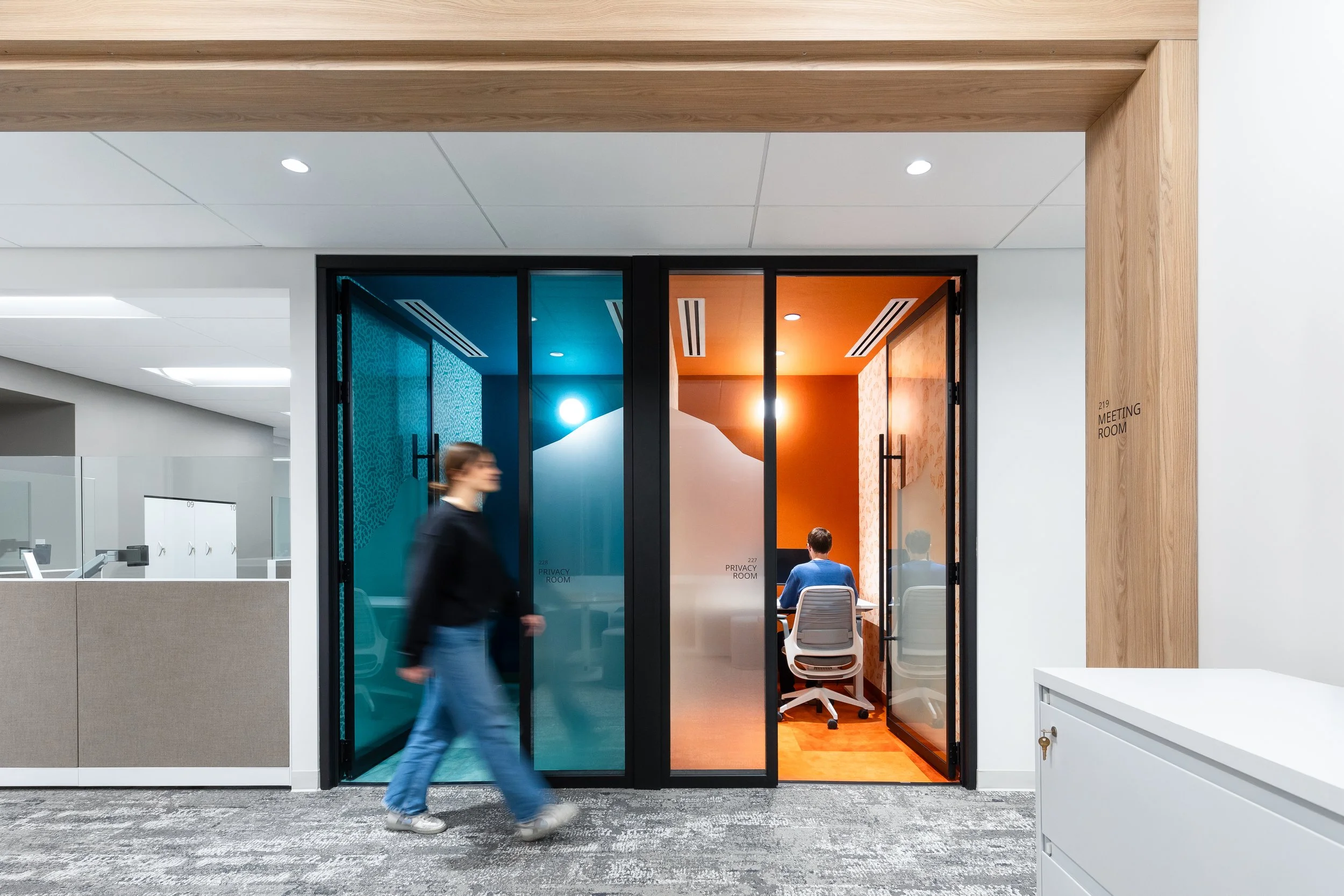
A project can look good at a high level, but what brings it together are the smaller moments. How materials terminate. How graphics integrate with architecture. How signage aligns with doors and glazing. How millwork comes together. How colour carries through a threshold. Those details might not be what somebody notices first, but collectively they're what makes a finished project feel complete.
The hope is that the staff using this space don't think about the framework at all. They simply choose the right setting for the task at hand — a quiet room for focus, a privacy room for a call, a collaborative area for a meeting — and feel comfortable, supported, and connected to the place.
Our main takeaway is that standards work best when they're treated as a framework rather than a formula. And that the design of a workplace and the management of the change it requires need to be integrated from the beginning, not treated as separate phases.
Into the Process - NRS Office Renovation
This article was written as part of the “Into the Process” series, a deeper dive into what made each project become what it is. Thanks to Alex Palmer and the O4 team for sharing their experiences during this process, and to the collaborators who helped bring this vision to life.